Blesta 3.0: Client Area
One thing we haven’t really talked about much is the client area. We have a good excuse: The vast majority of functionality is built into the staff/admin interface. But, the client experience is important too, arguably much more-so. In v2.x the client interface is identical in overall design to the admin interface with a slight color change.
In v3 we went a different direction. While there are similarities between the client interface and the admin interface they are completely different designs and you log into them independently.
Important notes to make about the client area in v3..
- The client interface has a new, clean & unique design.
- The client interface can be easily themed & integrated into an existing site.
- The client interface now consists of a Portal, Account Management, and Order System.
- The client interface is more intuitive and user friendly, and takes advantage of a lot of new features introduced in v3.
- Developers will be happy, Plugins can affect the client areas too.
- Mystery feature — yes I just did that, more details in a future post.
Portal, Account Management, and Order System. All tied together, all themed the same, all easily integrated into an existing site design.

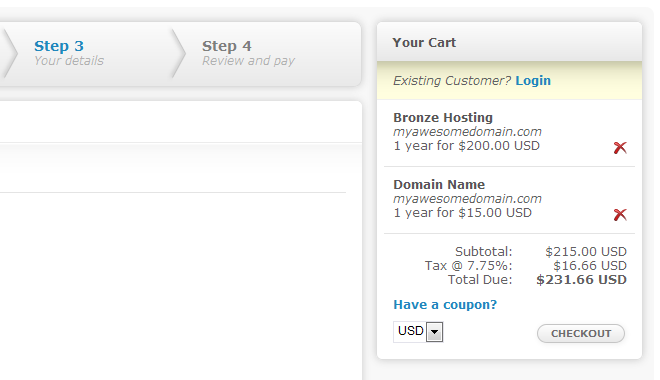
I can’t not leak some eye candy in a post, so above is a cropped segment of the default order template. I hope you agree, it’s a nice and clean design, yet fairly neutral in terms of color. Though the header is not shown here, it does have color and the color is easily changed.
There’s a lot more I could show you, but we’ll cover more in a future post. And to all a good weekend!
